The problem
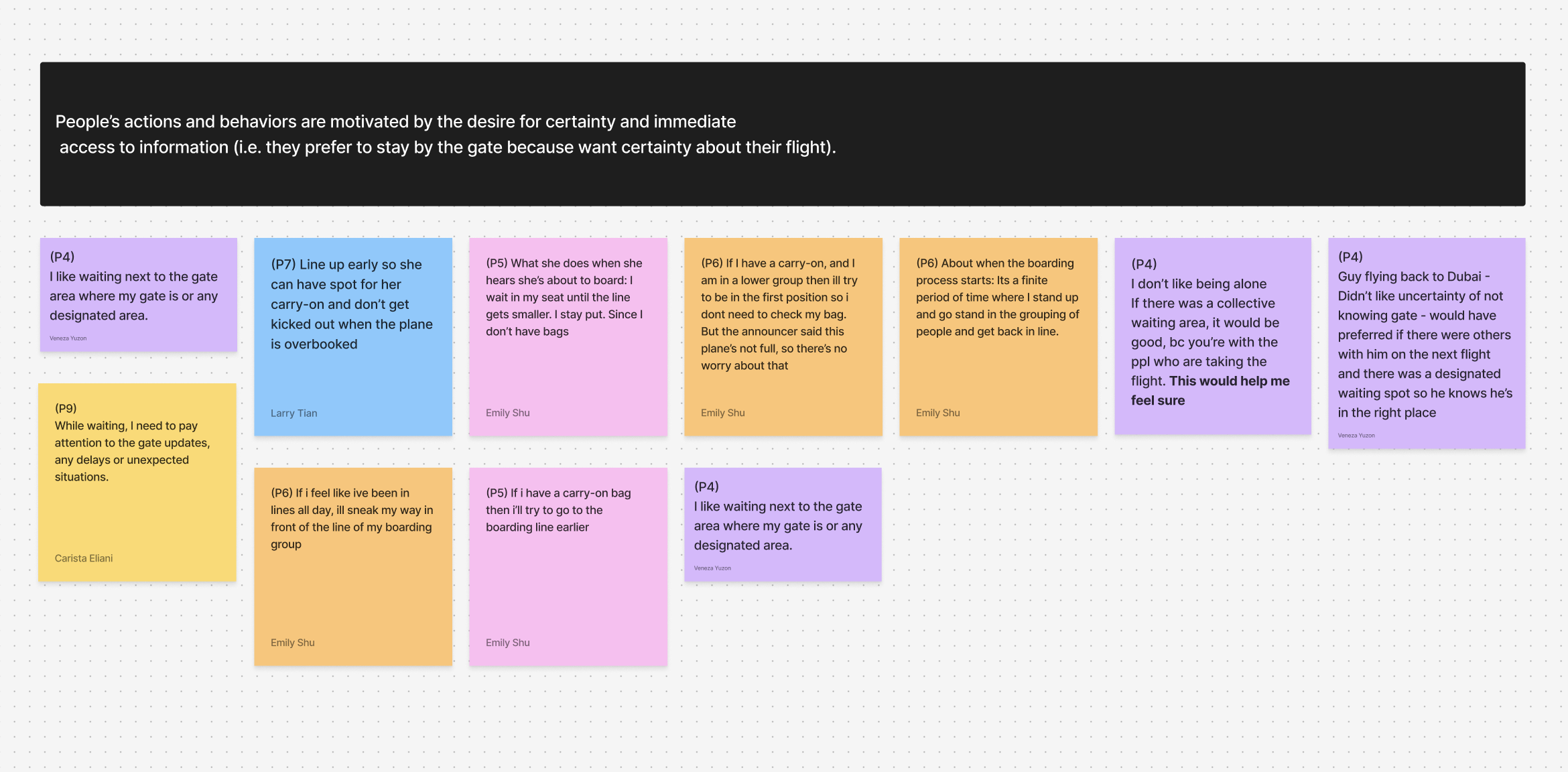
Research synthesis from an observation study at SeaTac Airport
Research synthesis from an observation study at SeaTac Airport
Passengers receive an assigned overhead bin at check-in
In-app and optional push notifications keep passengers in the loop about their carry-on
Drop off carry-on bag at the gate to be pre-loaded
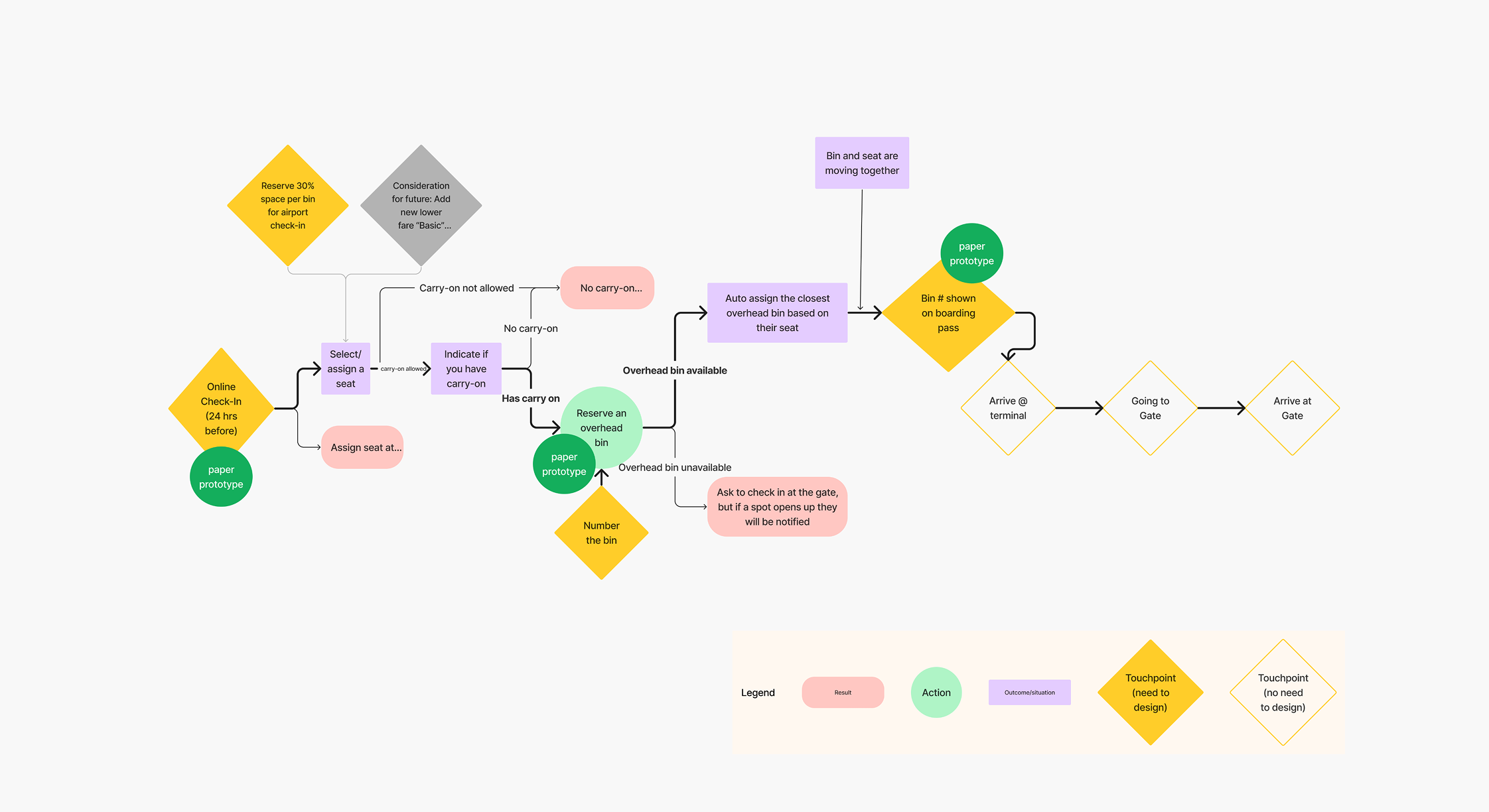
User journey of the overhead bin reservation experience
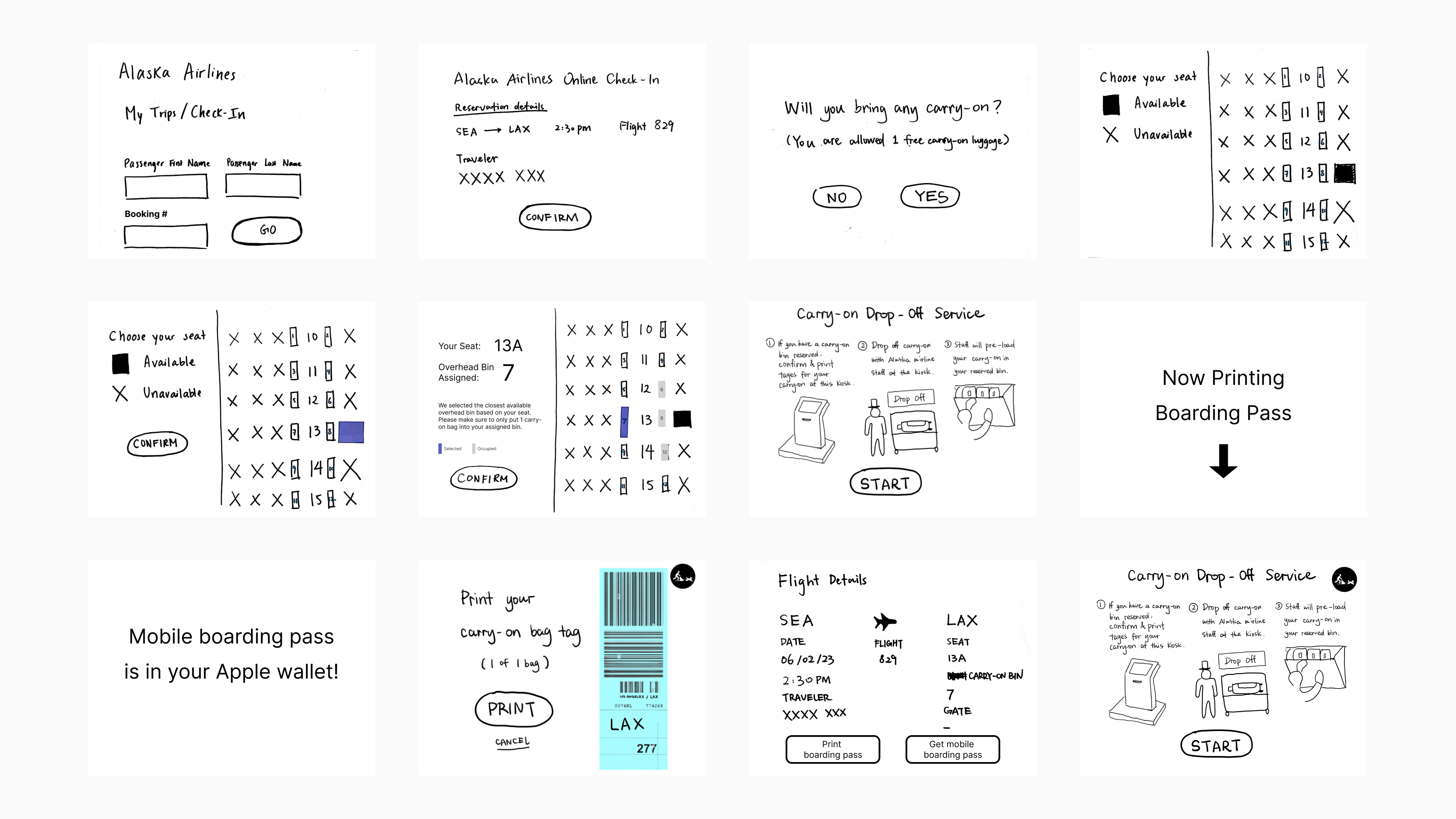
Low-fidelity screens of an initial prototype we tested on users